


![]()
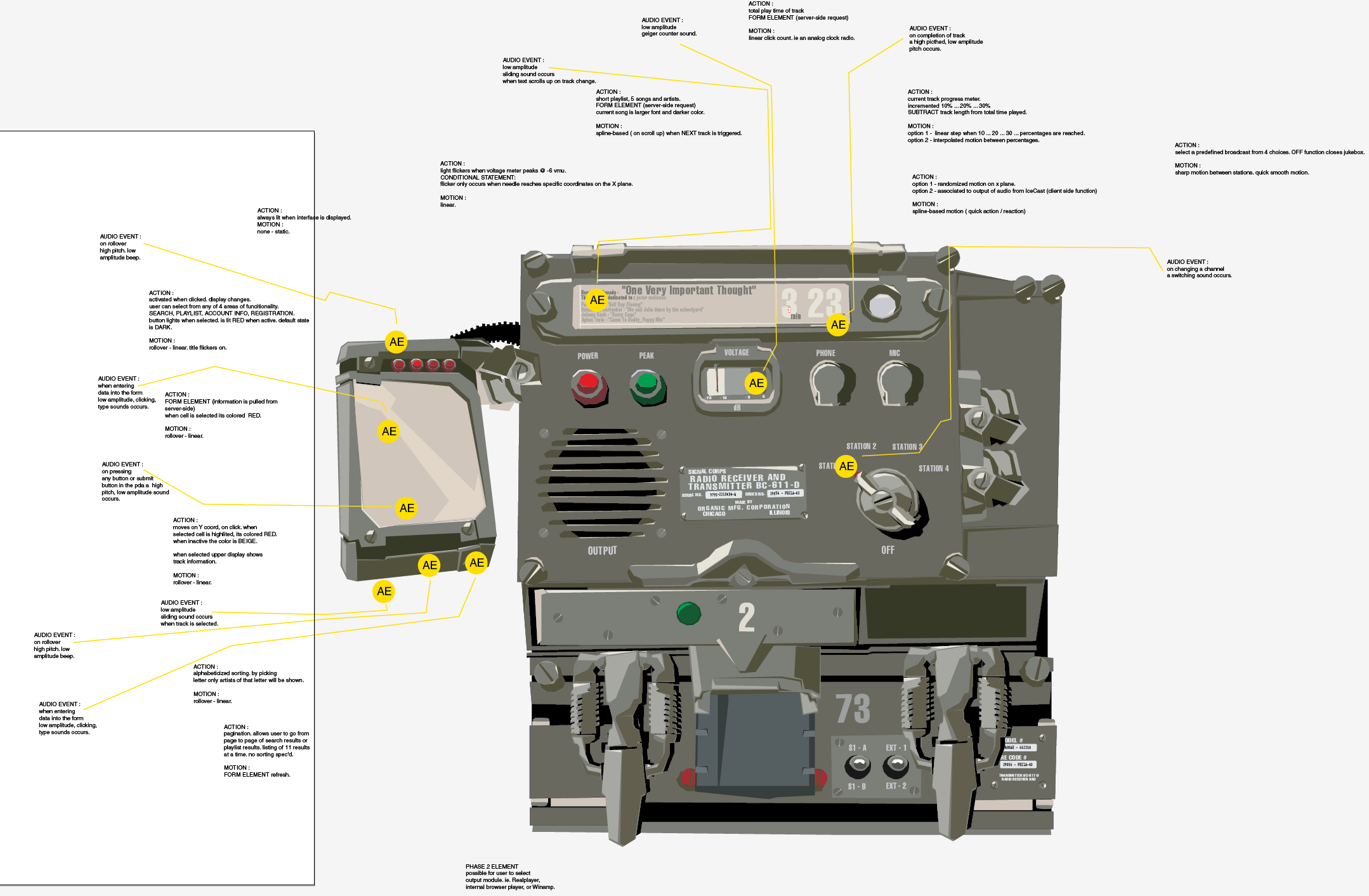
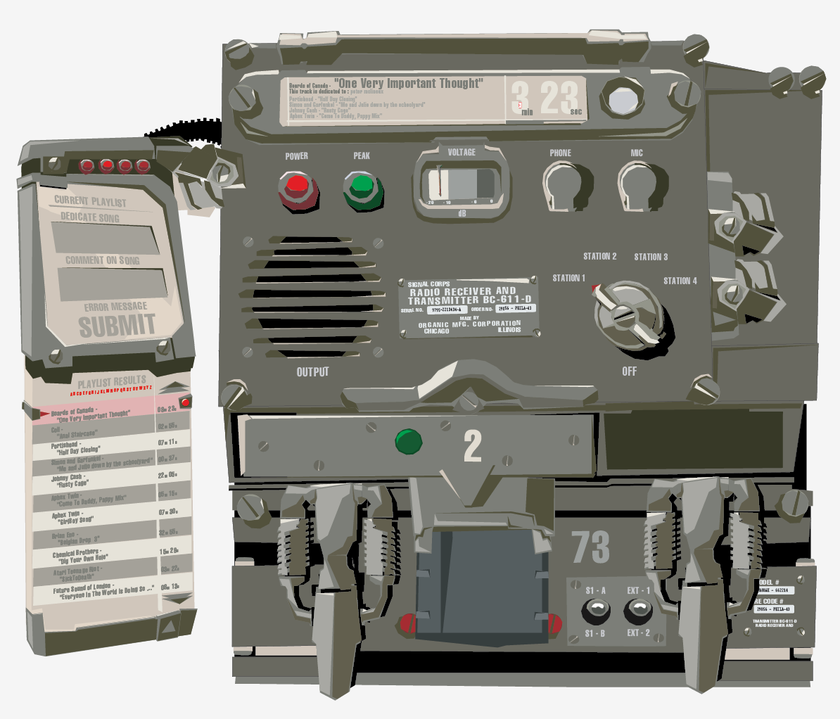
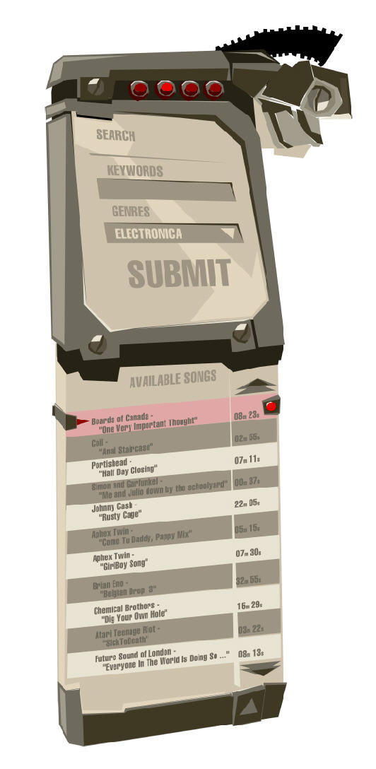
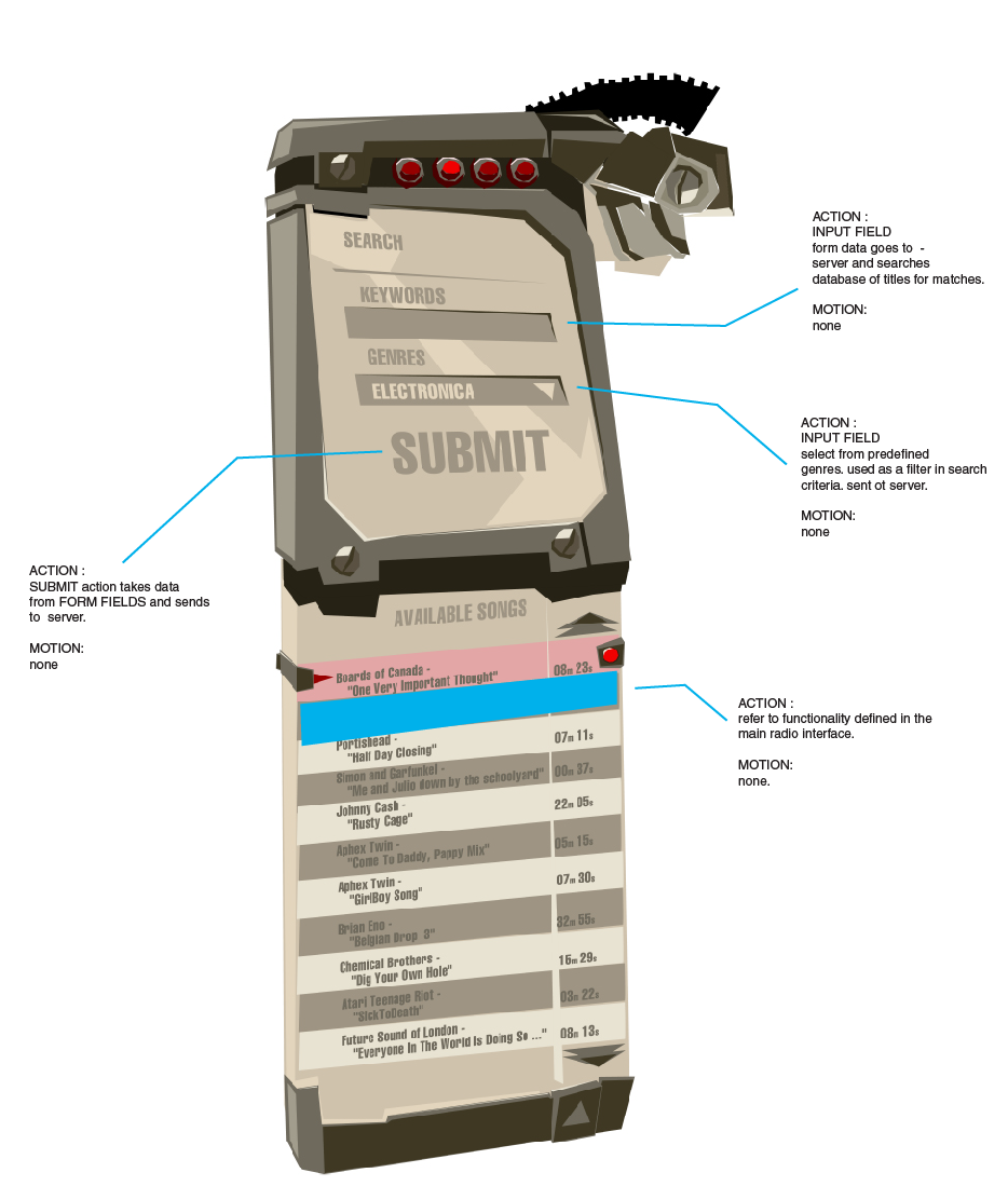
My creative process is focused around the Lean UX / Agile methodology; instantly bringing a design into focus and delivering amazing experiences. This takes shape by stripping a deliverable down to its core components, providing a level of detail necessary to kick-start development. The goal is to get ideas quickly visualized and in front of the team, showing work early and often.
The key is collaboration, which becomes critical to the success of the team and ultimately, the product. Not your stereotypical solitary designer "lone wolf" - I'm in your implementation team, co-mingling with subject-matter experts or conducting a contextual inquiry with customers. Here conversation occurs dynamically, with laser beam energy. Work is printed up, displayed on walls available for review sessions, adhoc conversations, ideation or inspiration.
If you're looking for a user experience designer who delivers in short, iterative, fast-paced cycles, integrating feedback from all members of an implementation team, leading to high quality product experiences, we should talk.
Take a look around. To the right you'll find retrospectives on some of my most popular projects. The links below are a few deviations I've explored. Feel free to reach out to see even more recent and relevant work.
Home
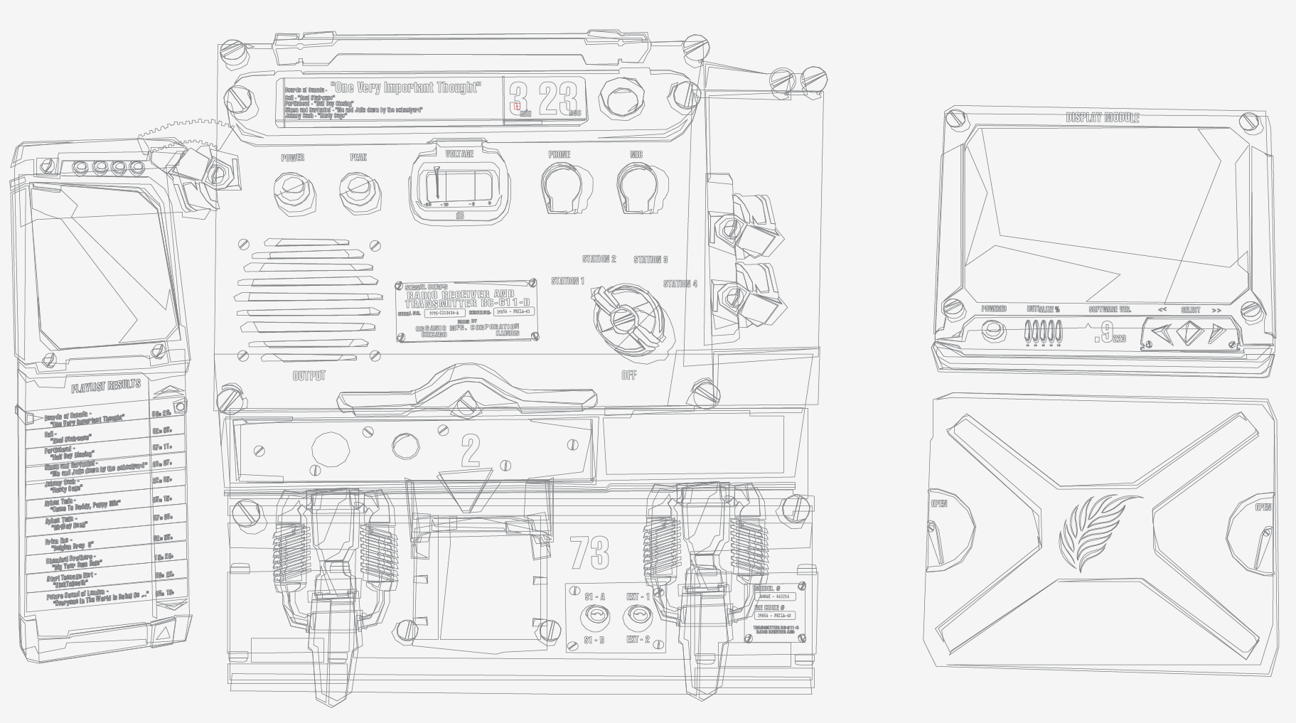
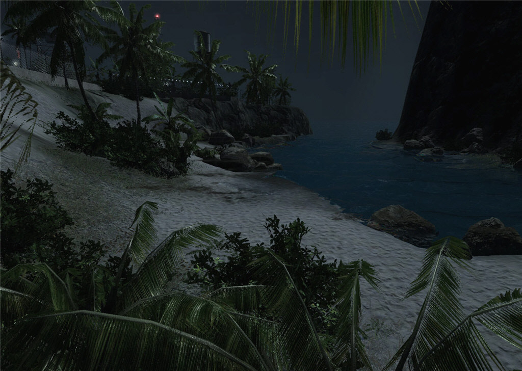
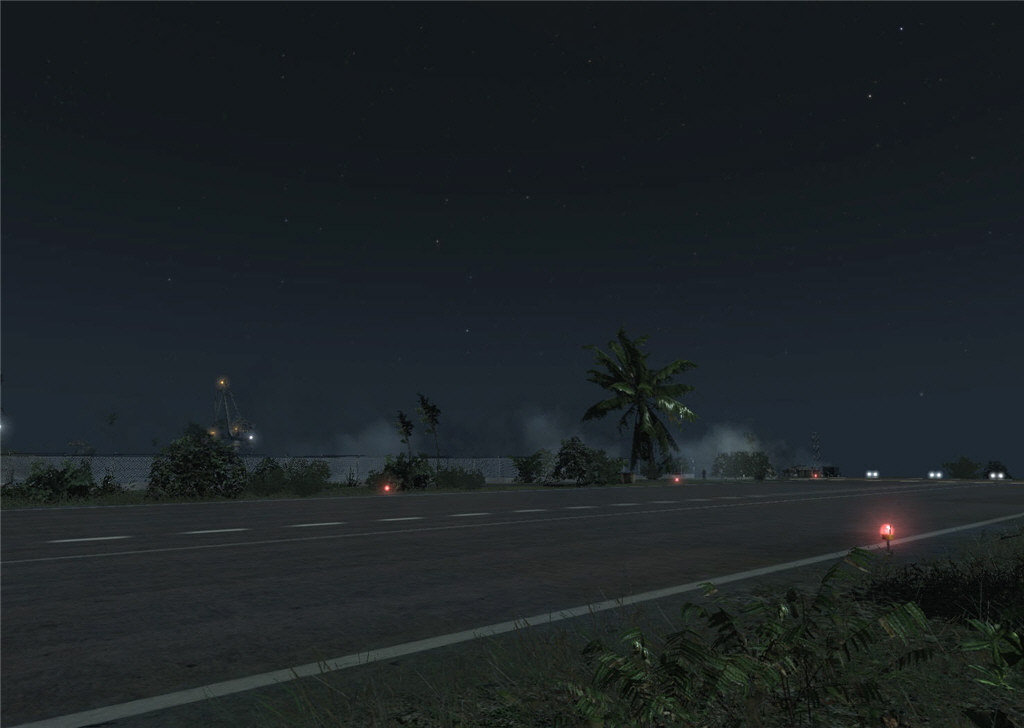
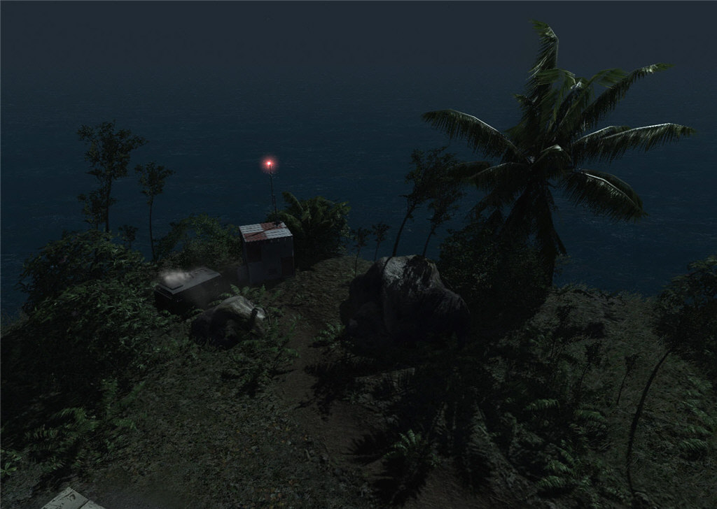
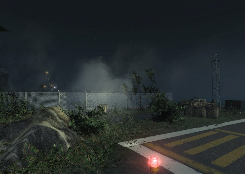
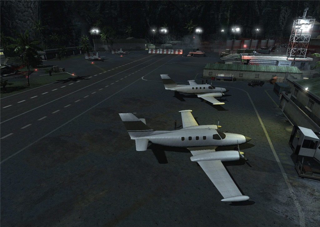
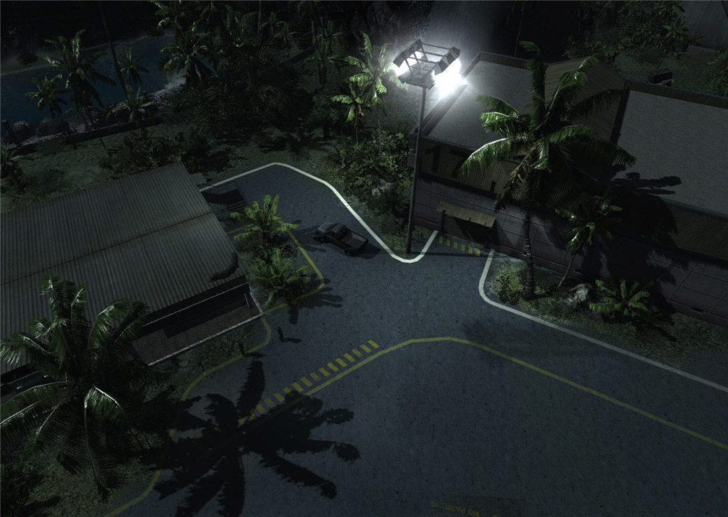
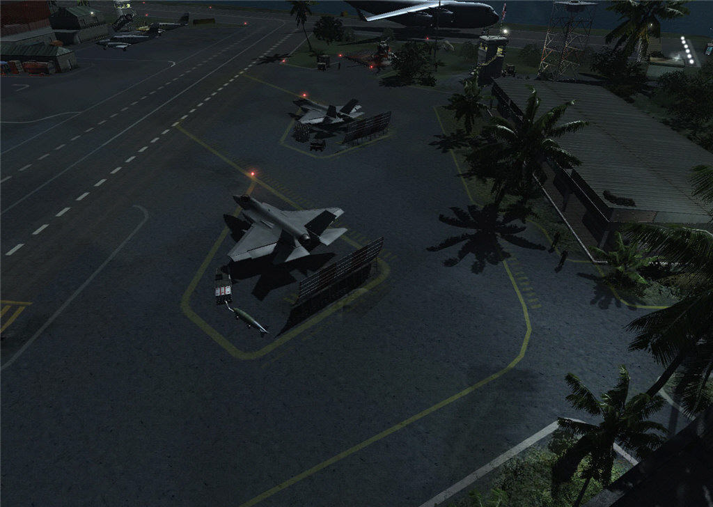
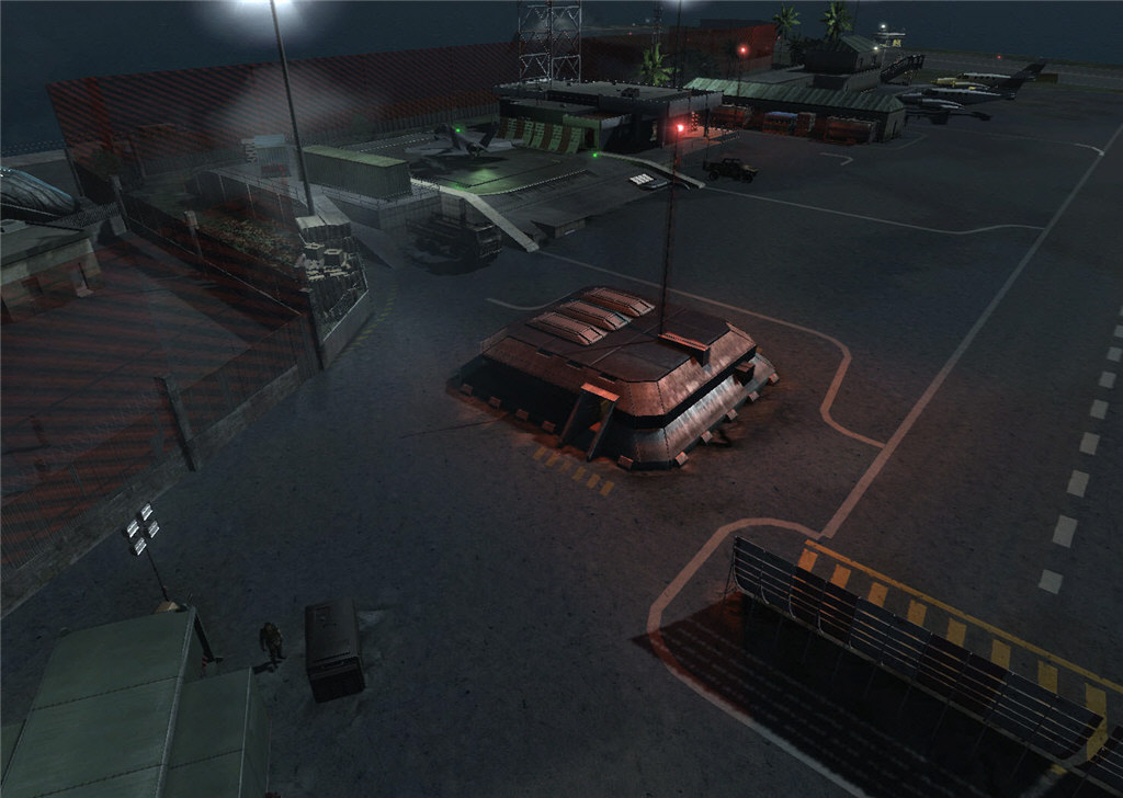
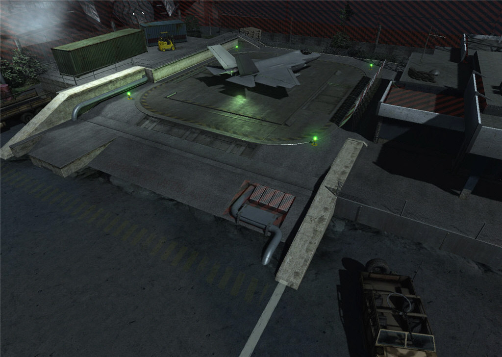
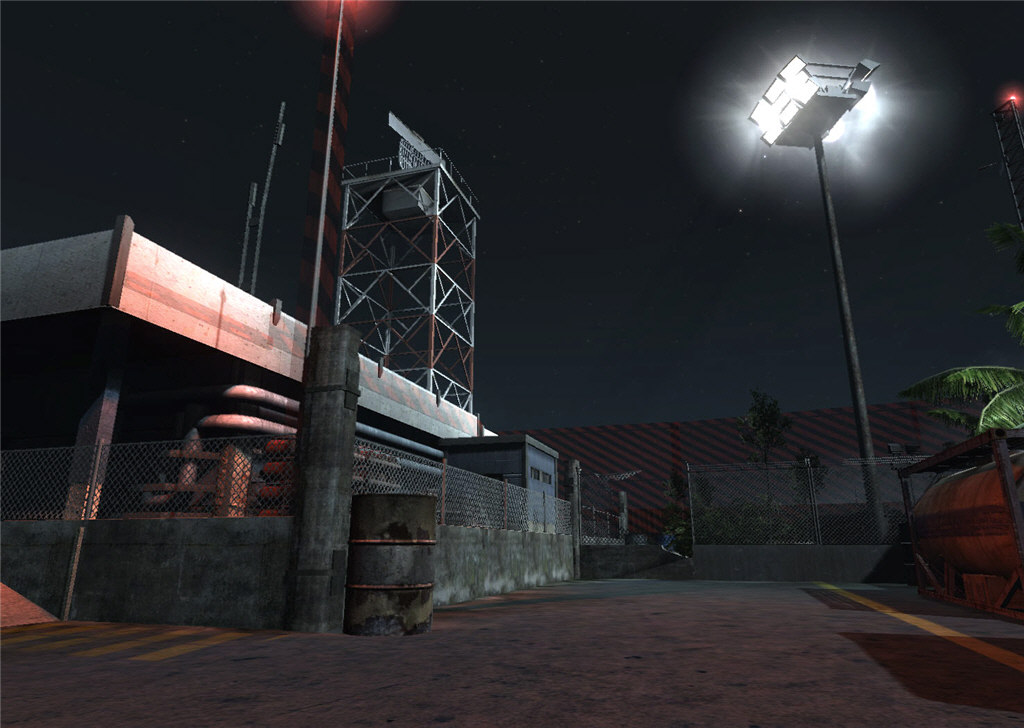
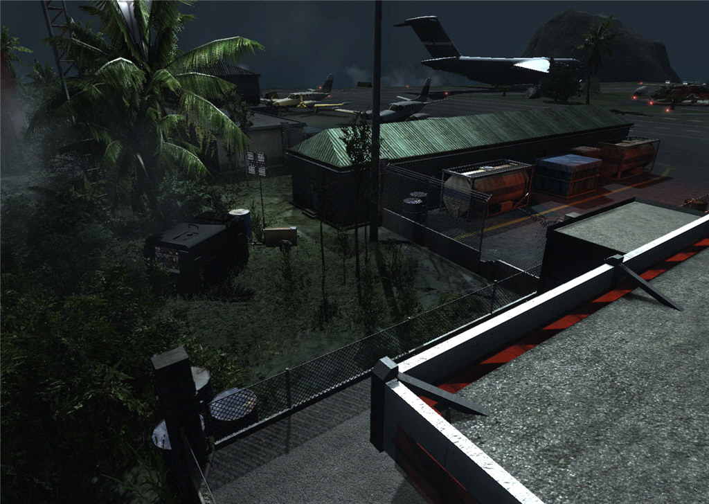
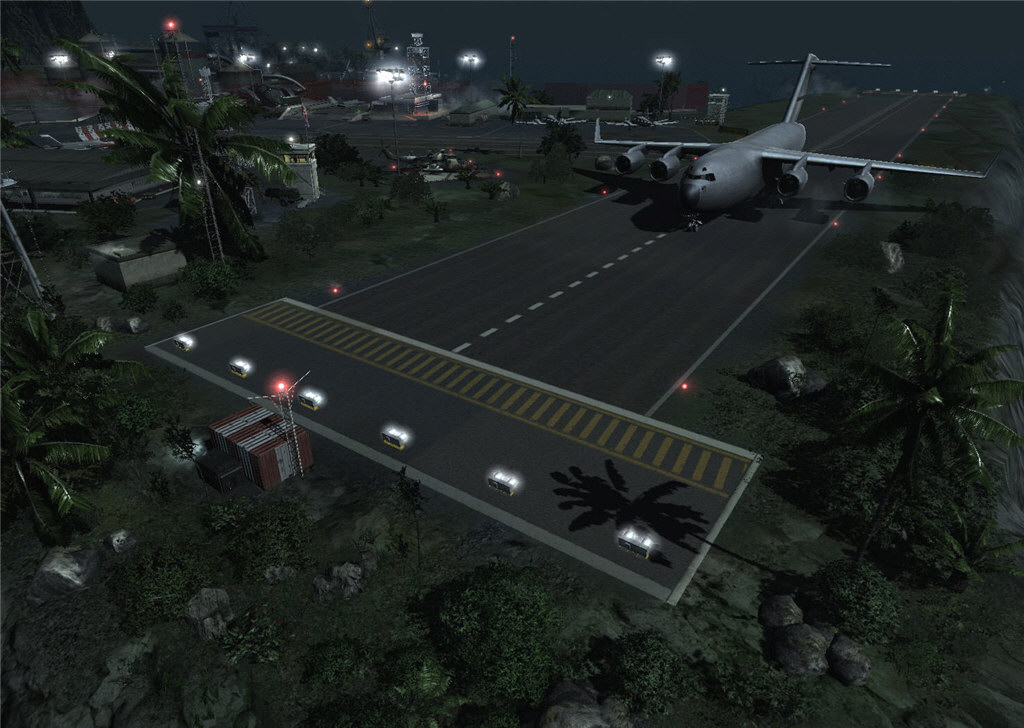
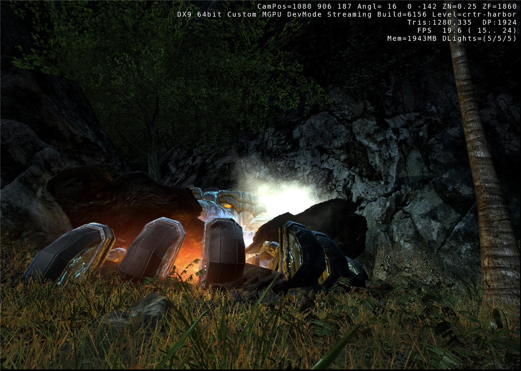
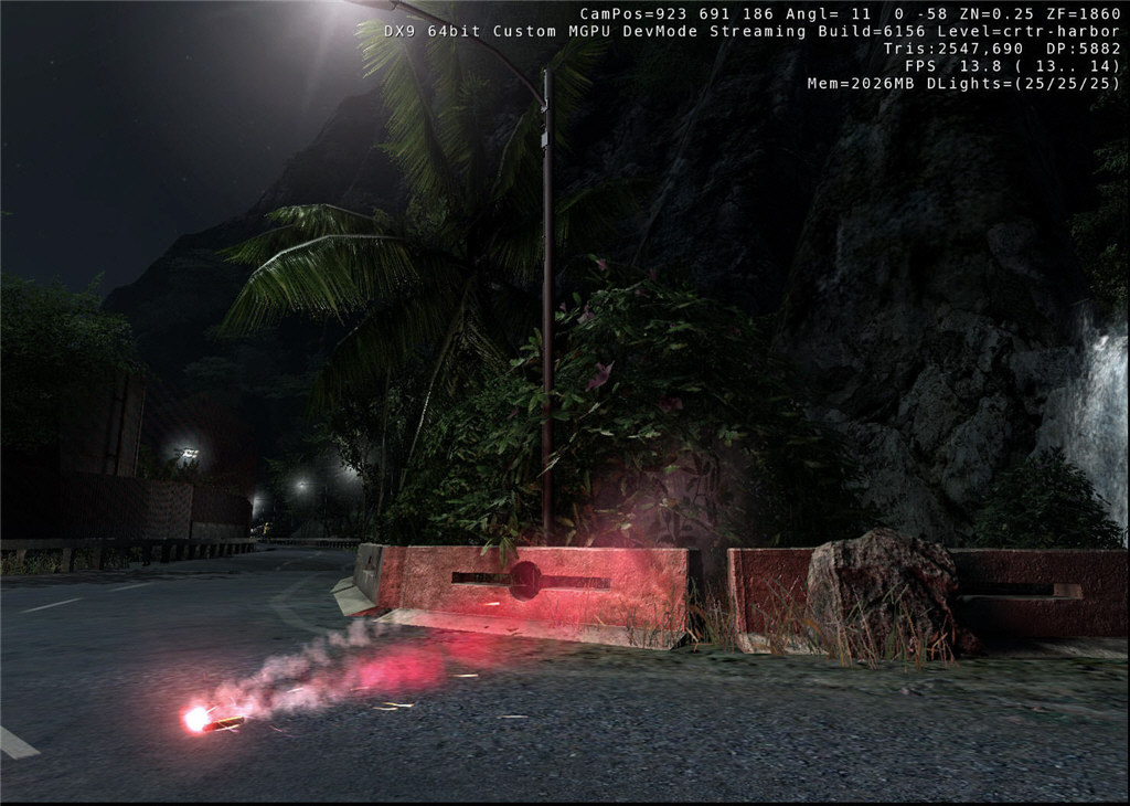
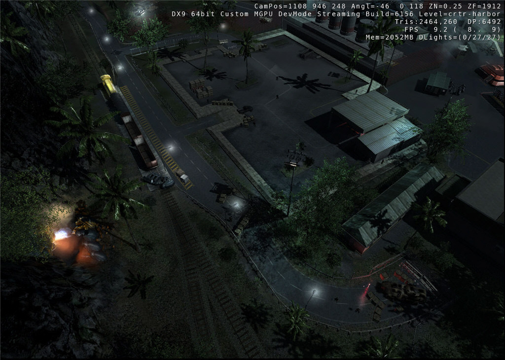
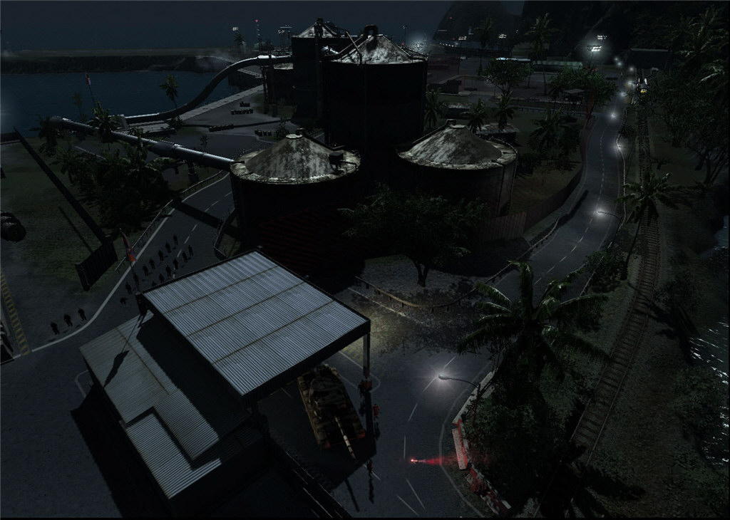
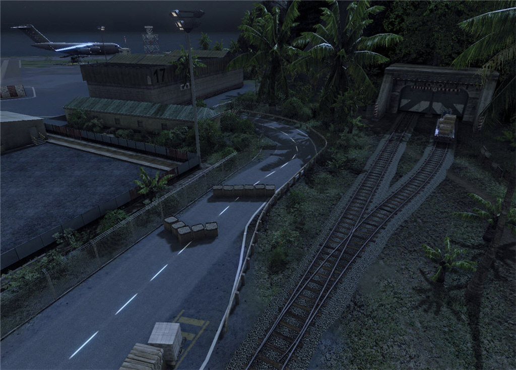
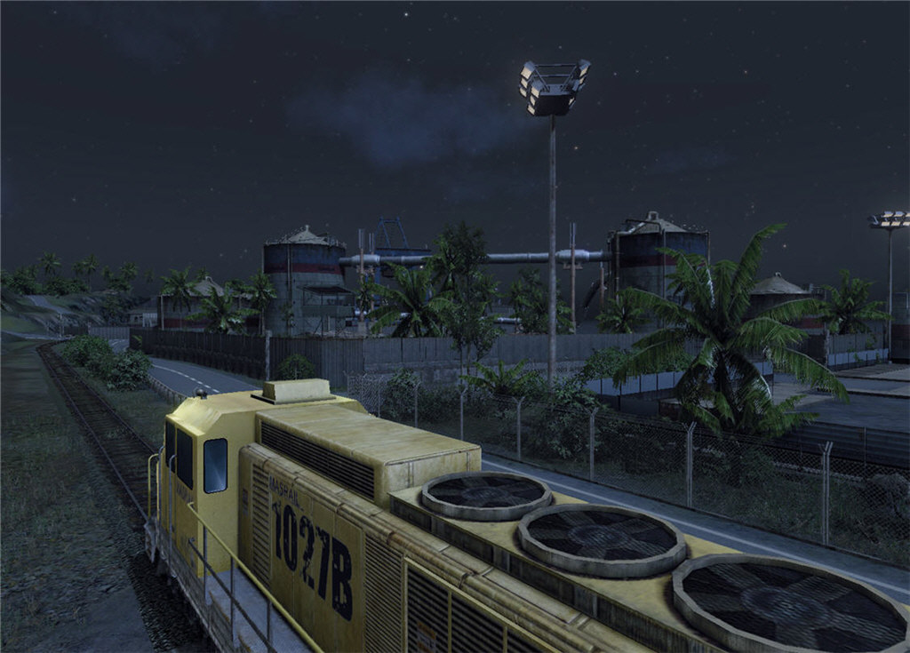
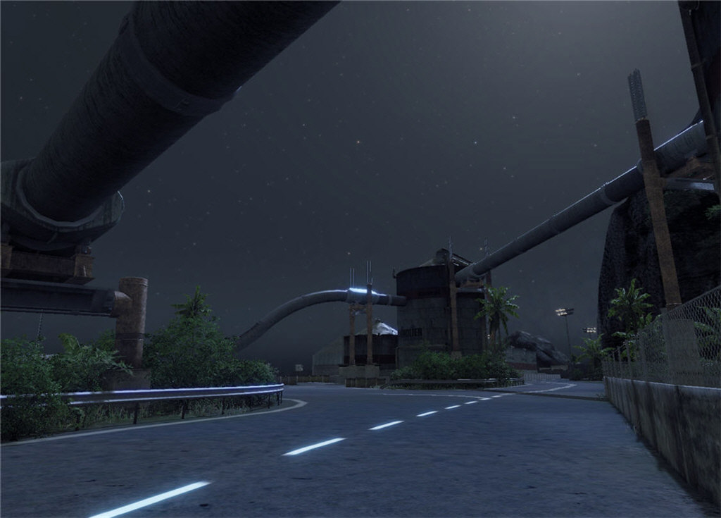
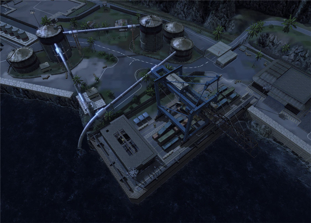
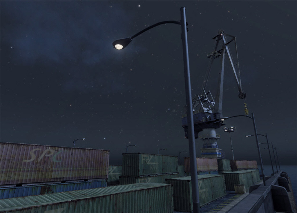
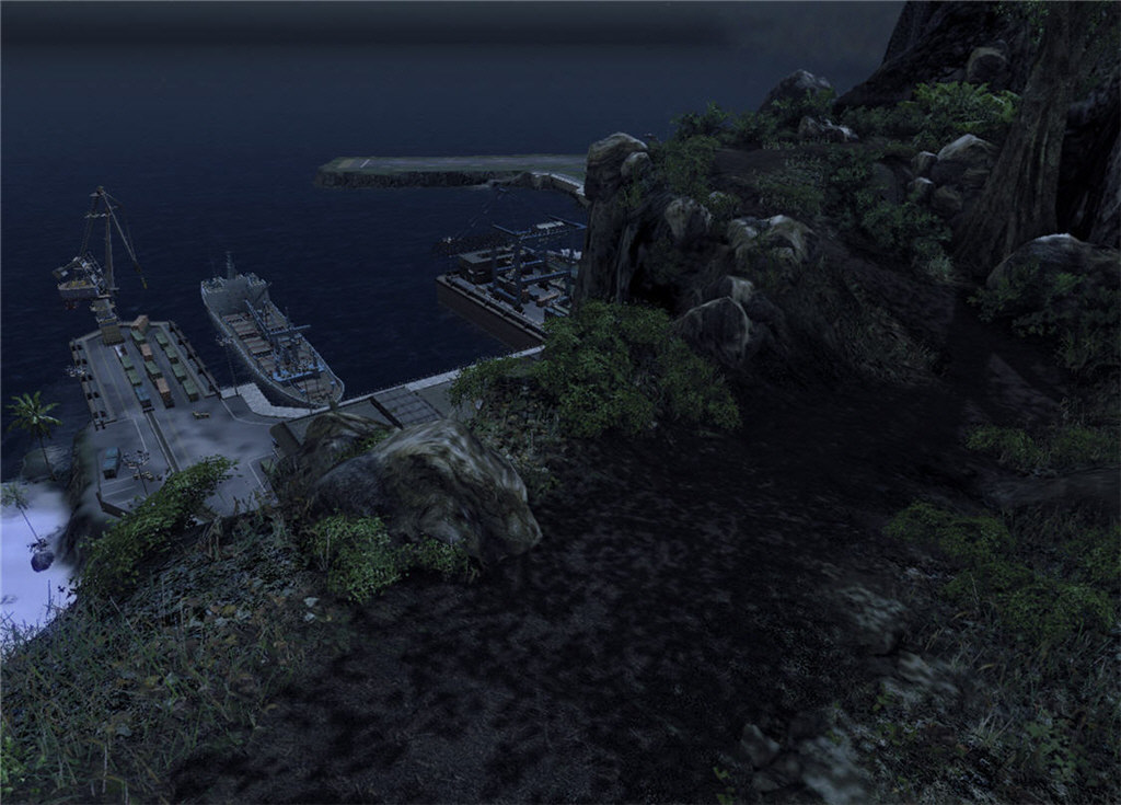
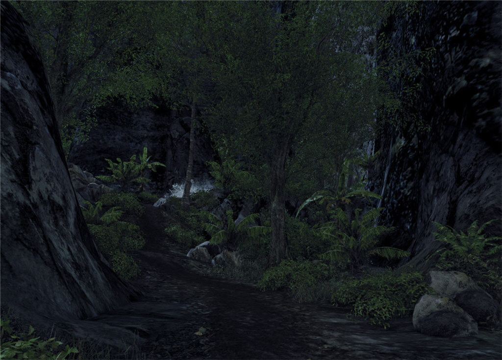
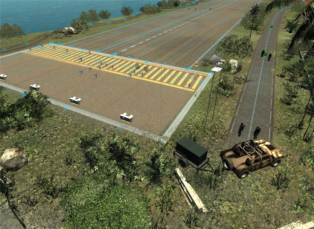
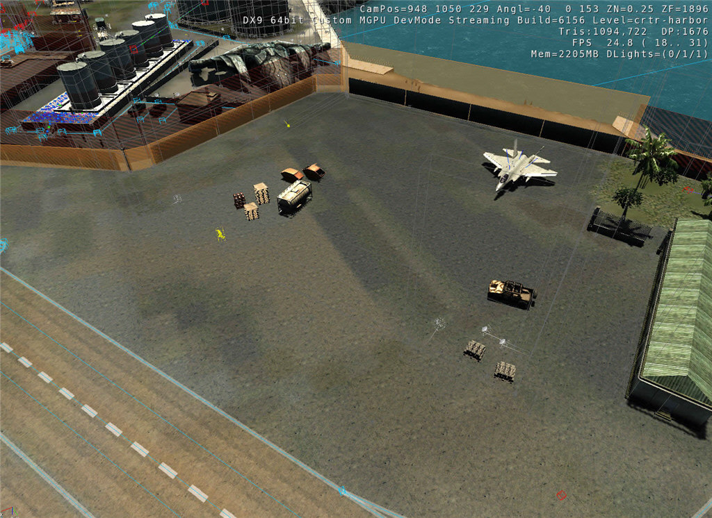
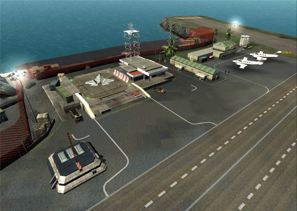
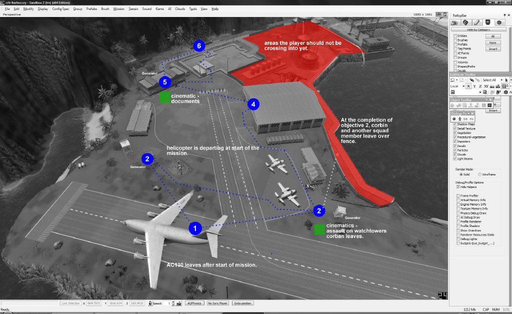
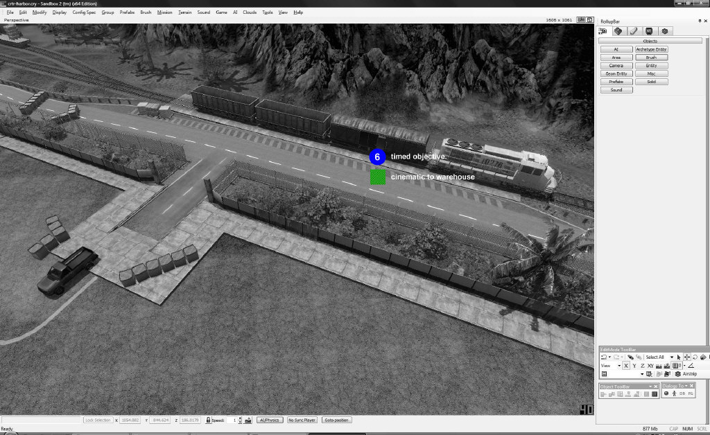
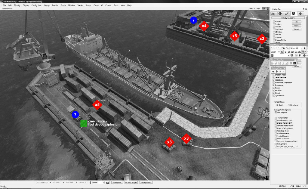
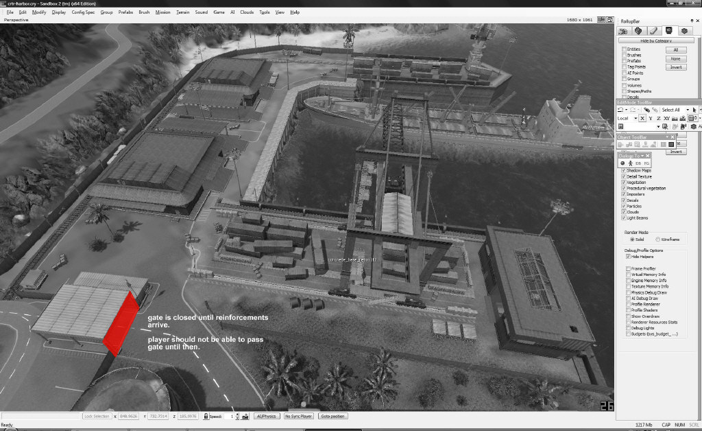
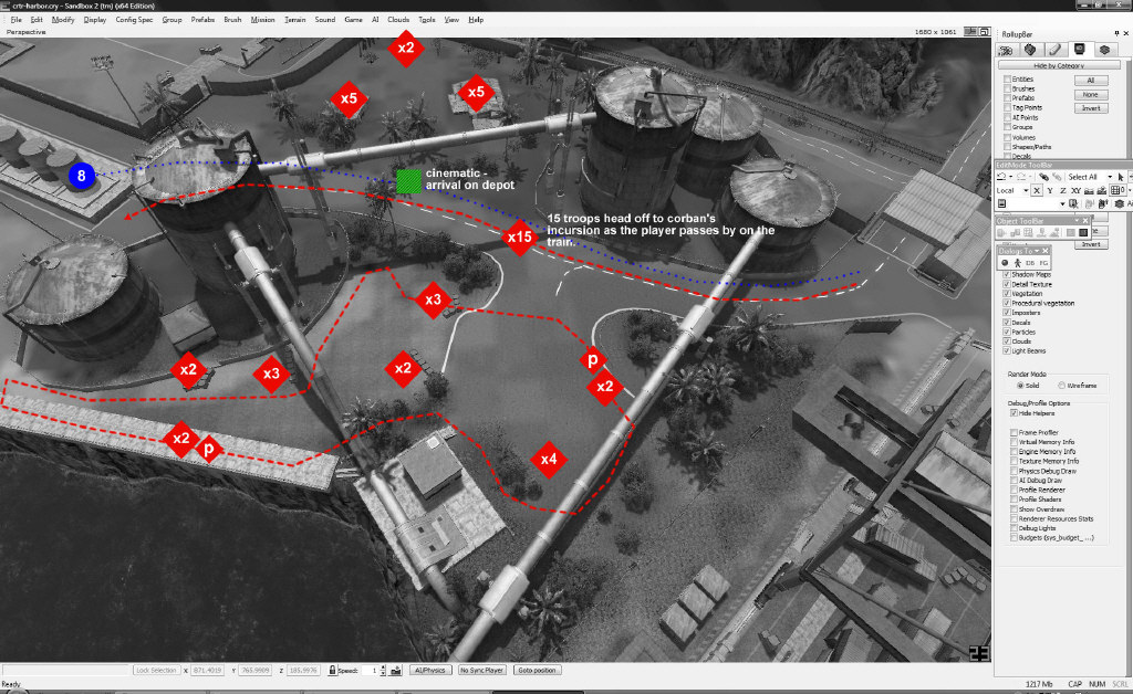
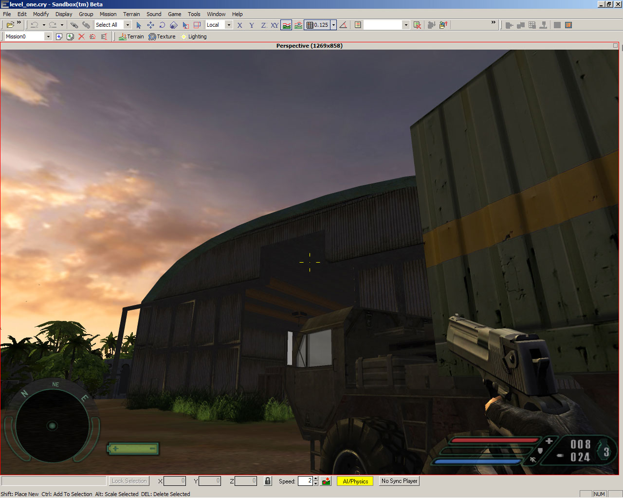
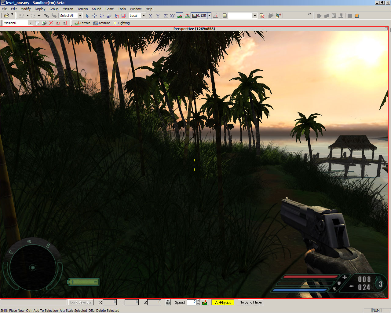
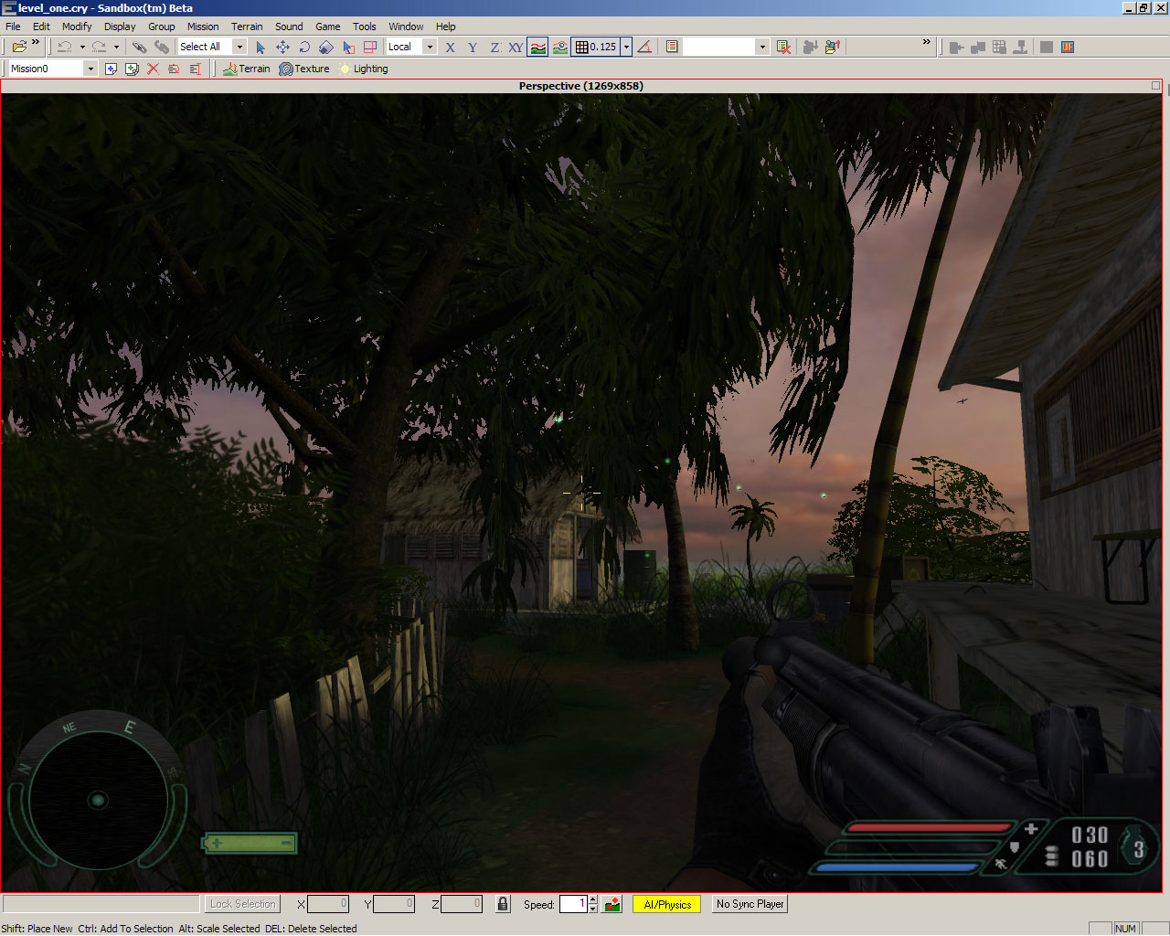
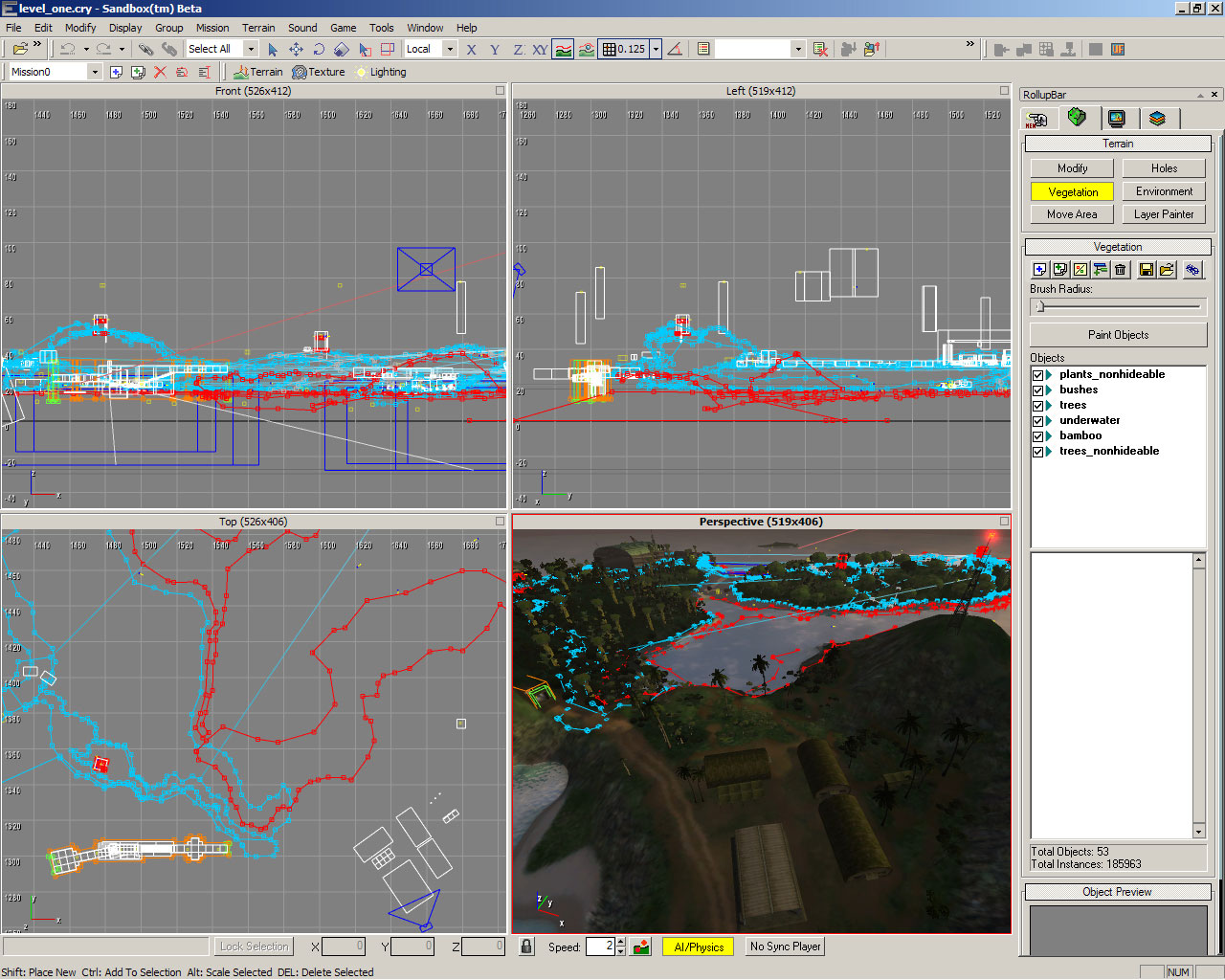
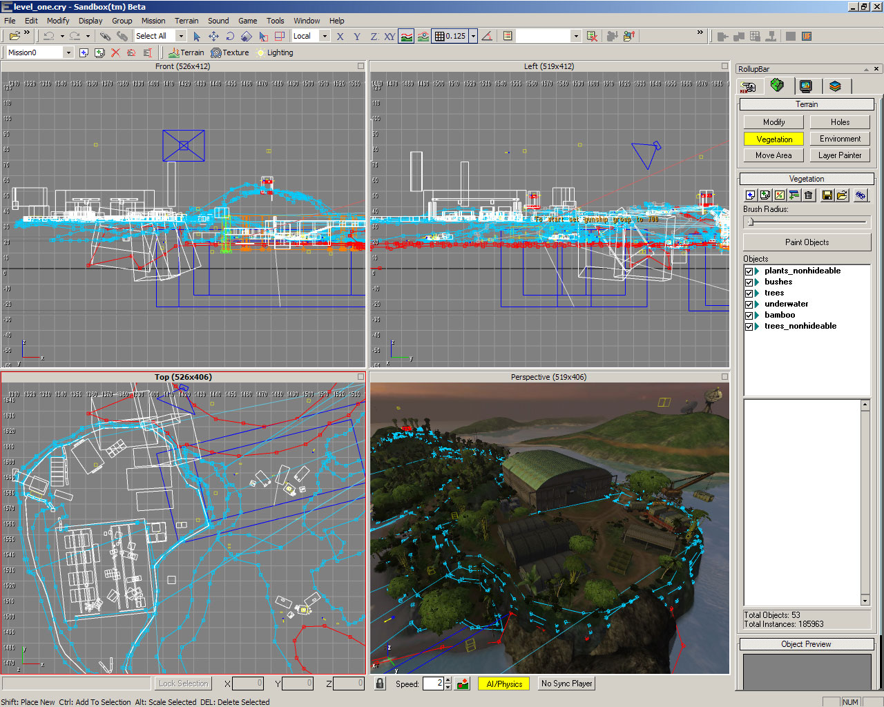
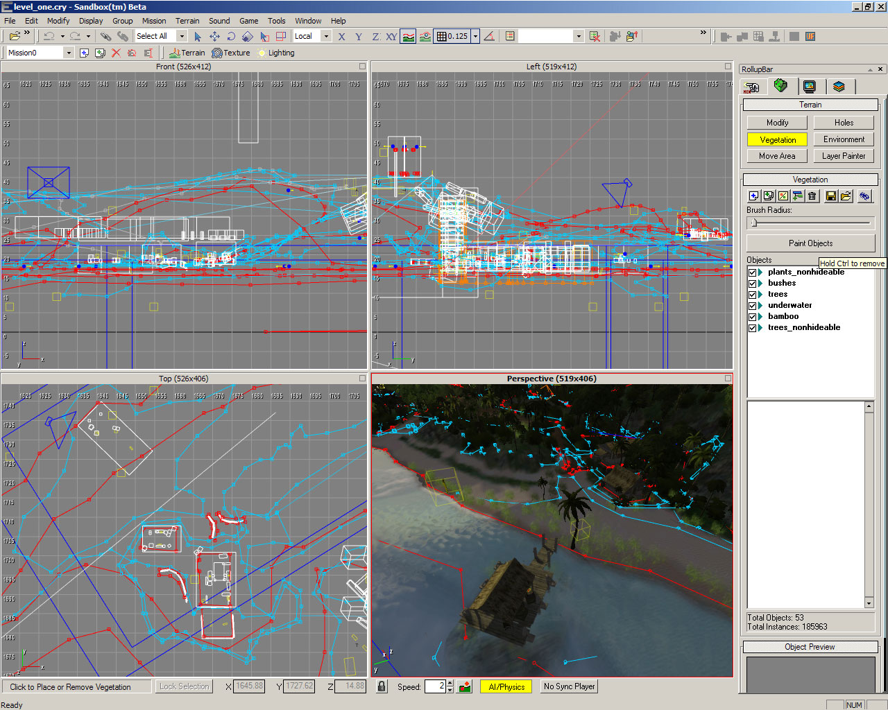
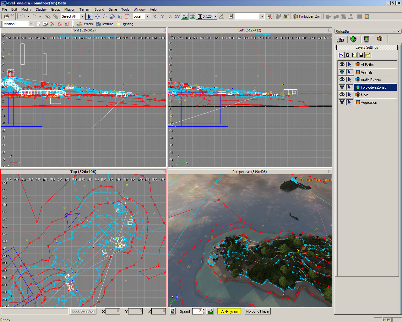
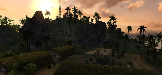
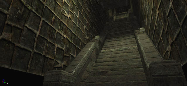
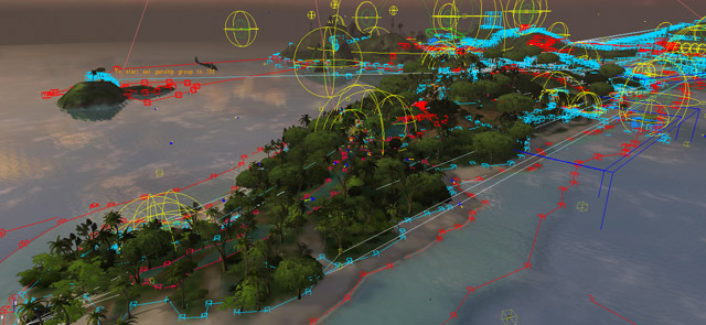
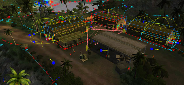
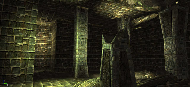
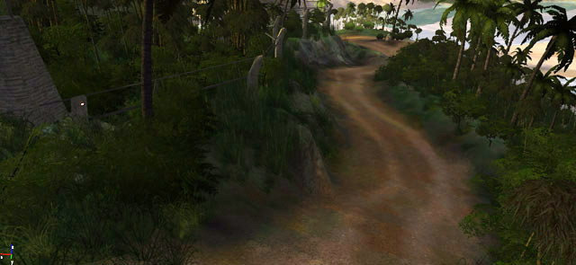
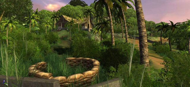
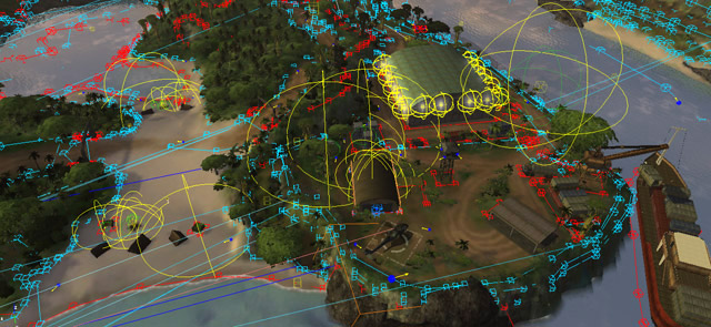
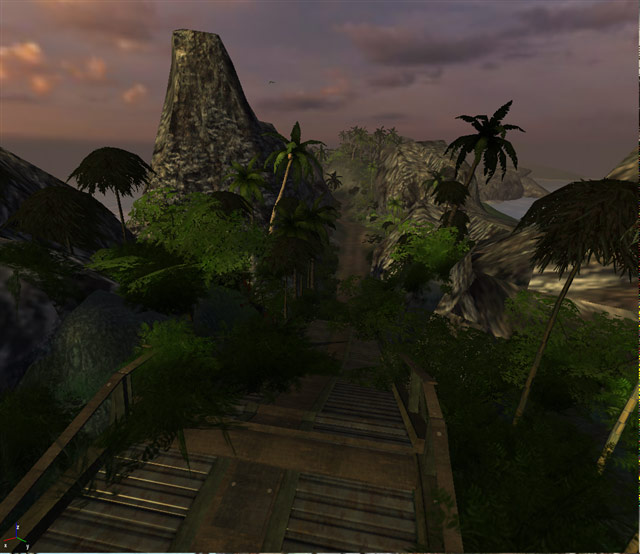
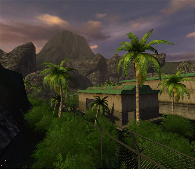
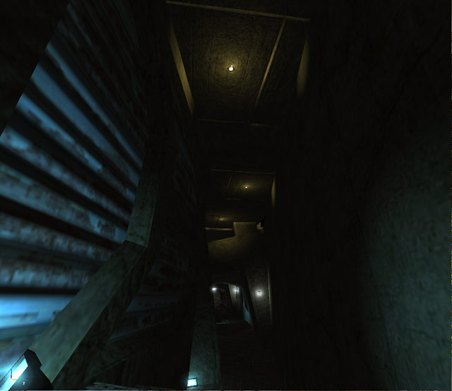
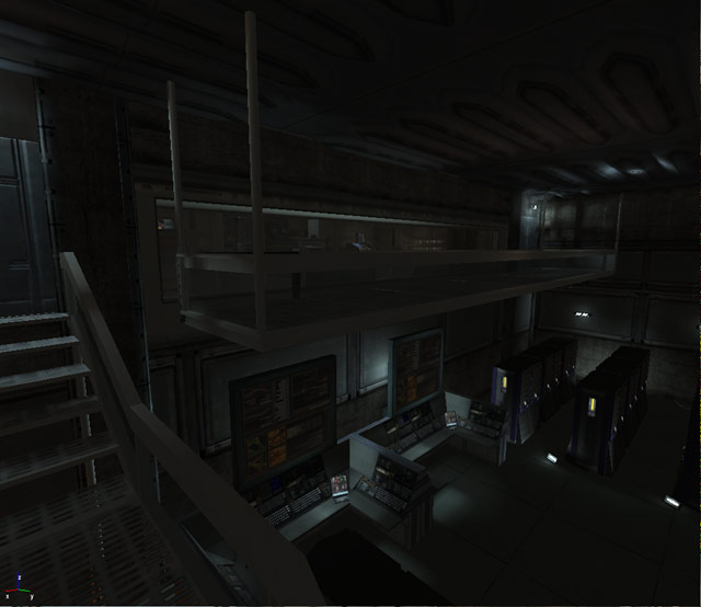
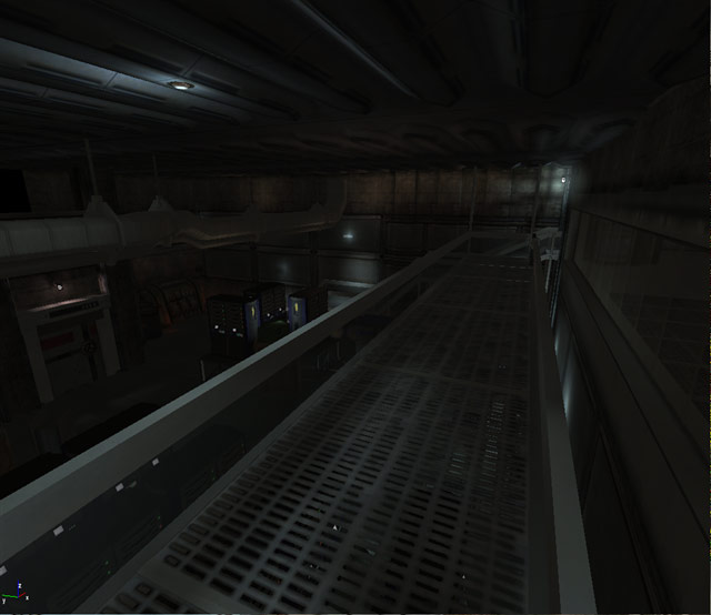
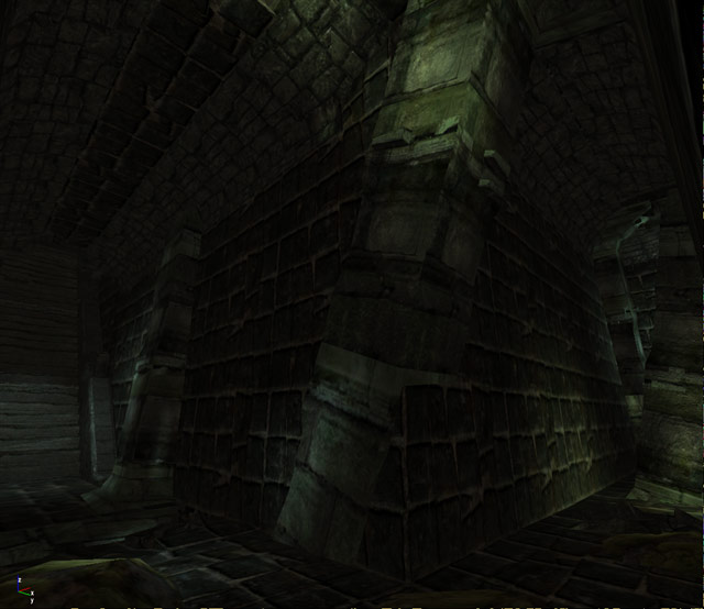
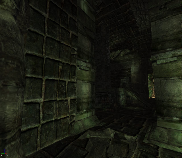
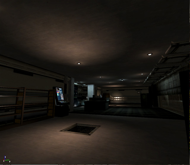
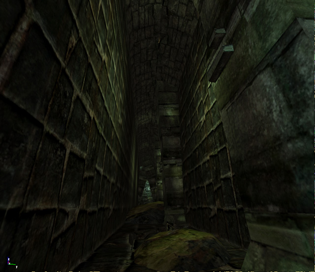
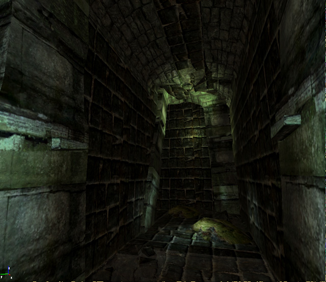
 Level Design
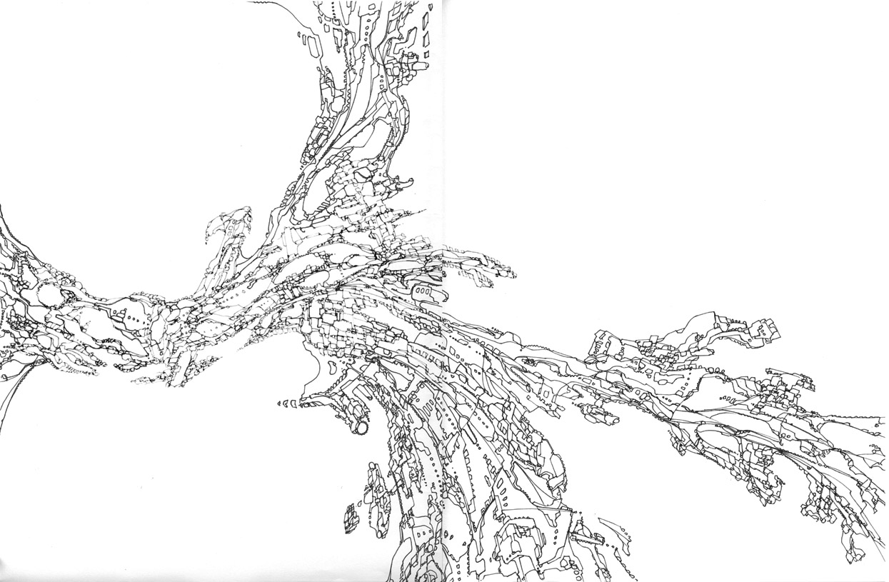
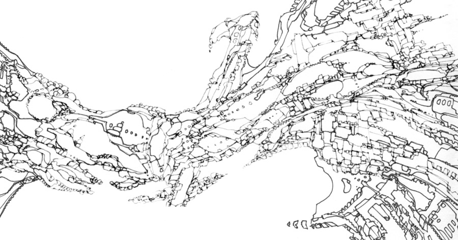
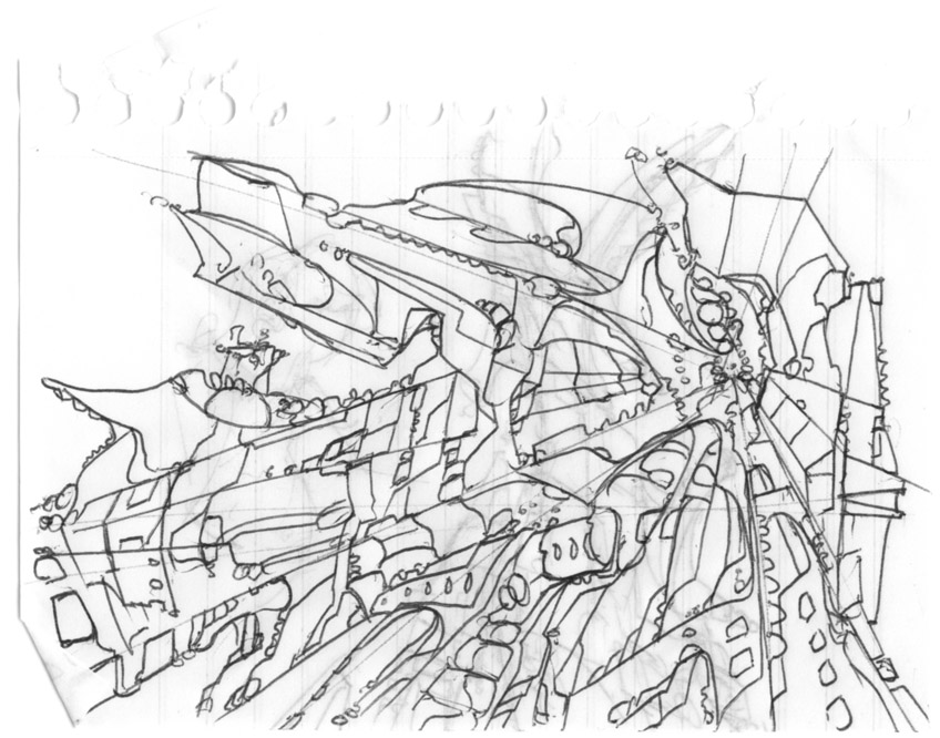
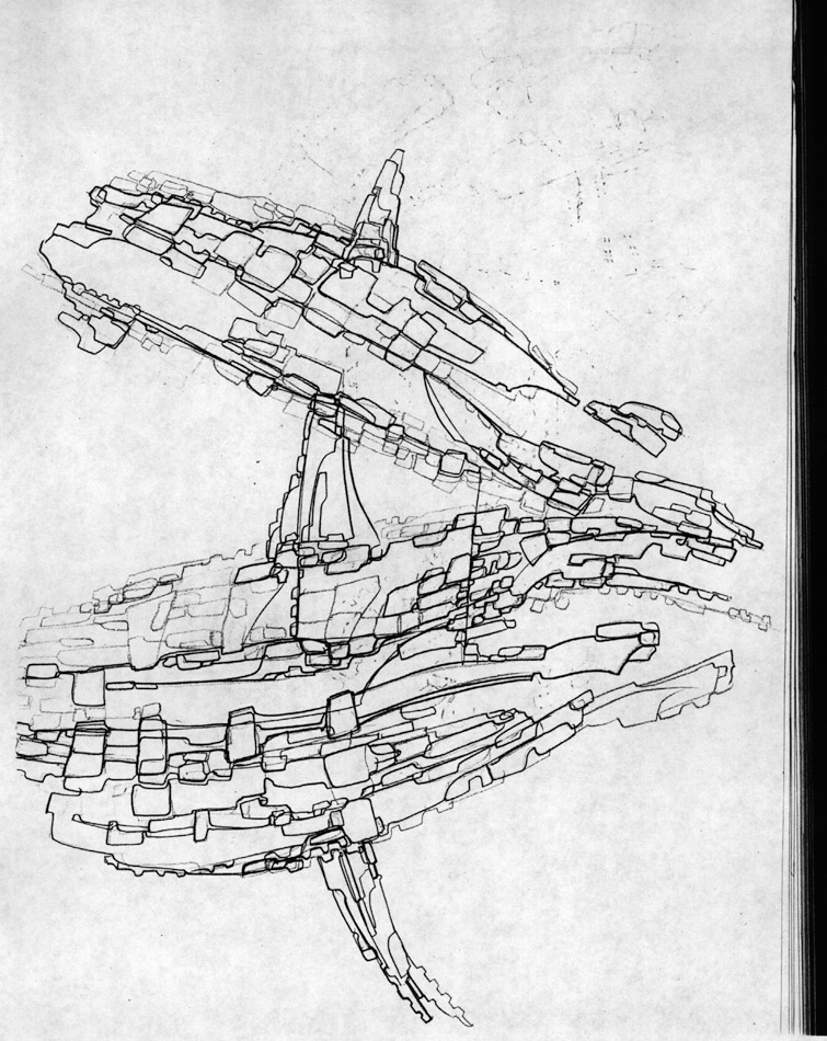
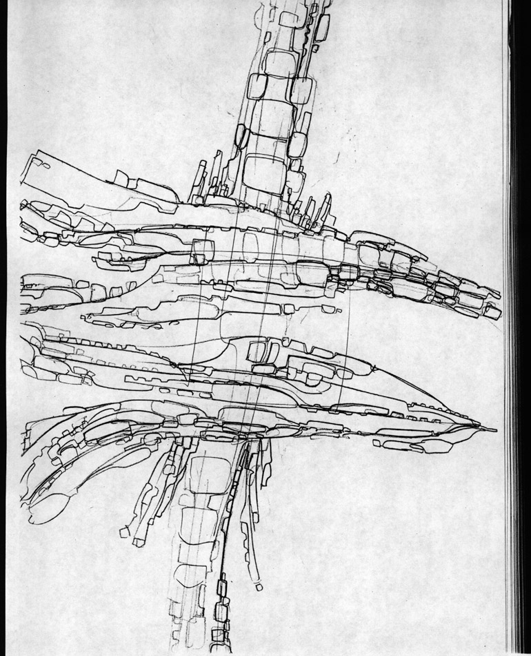
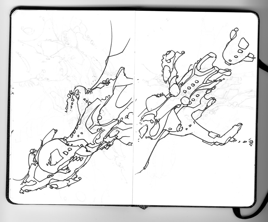
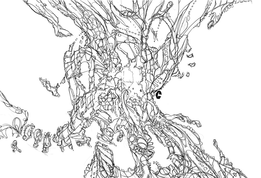
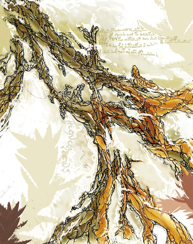
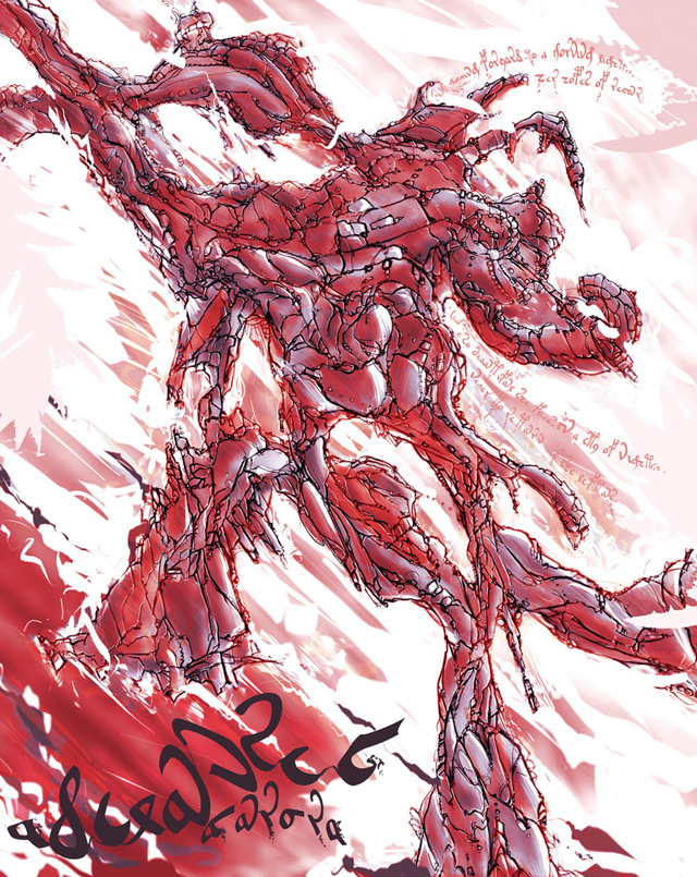
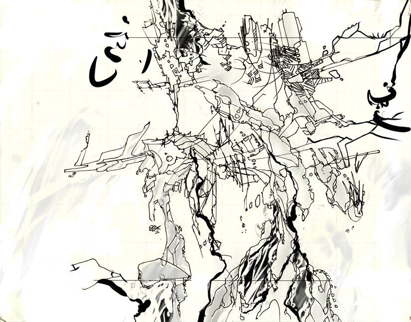
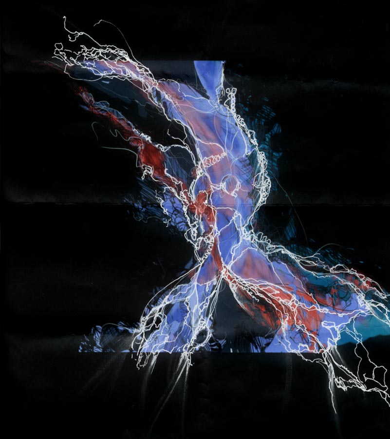
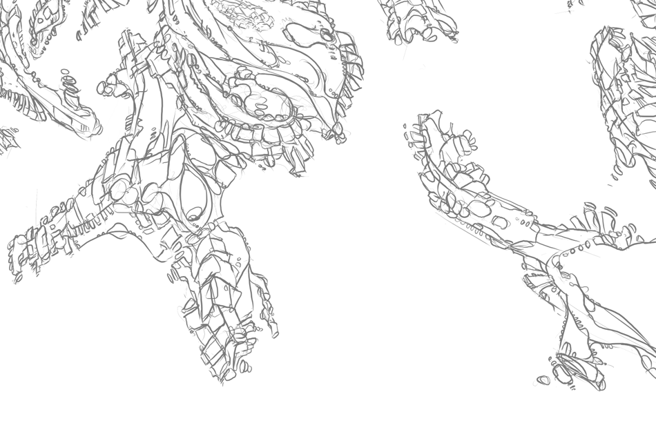
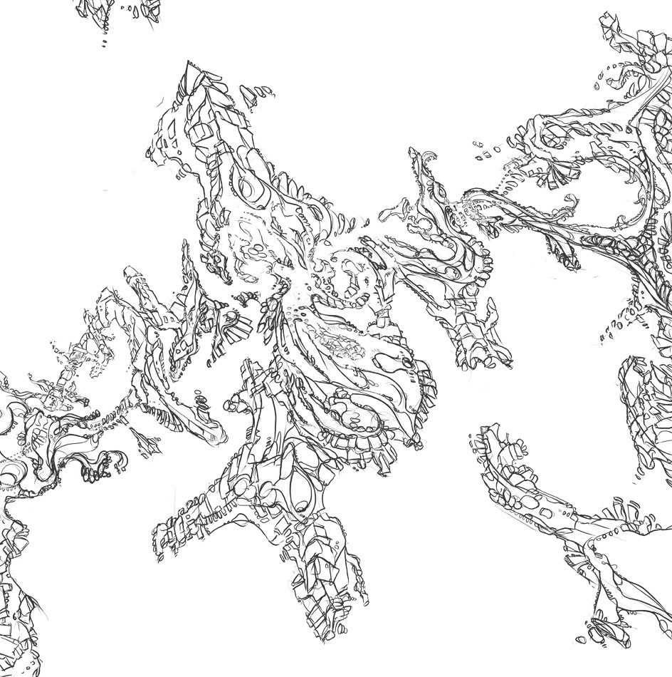
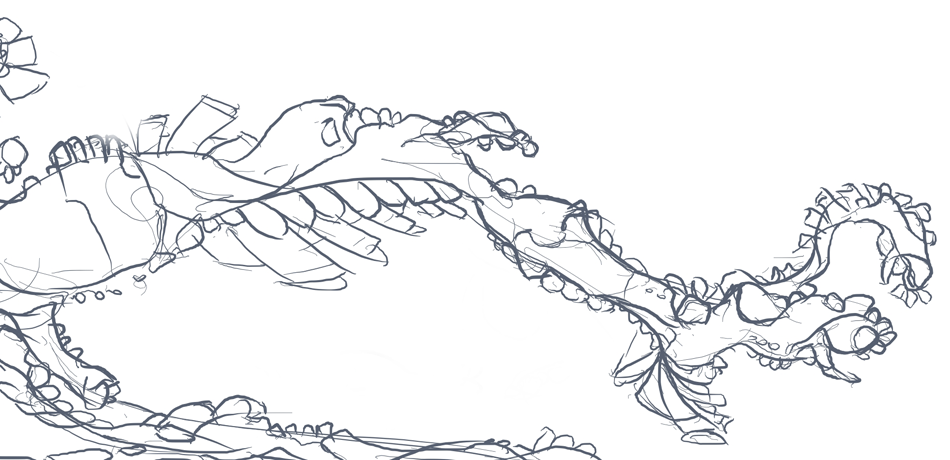
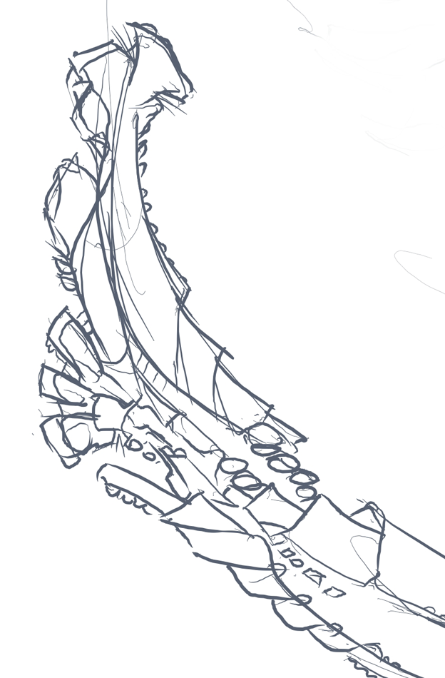
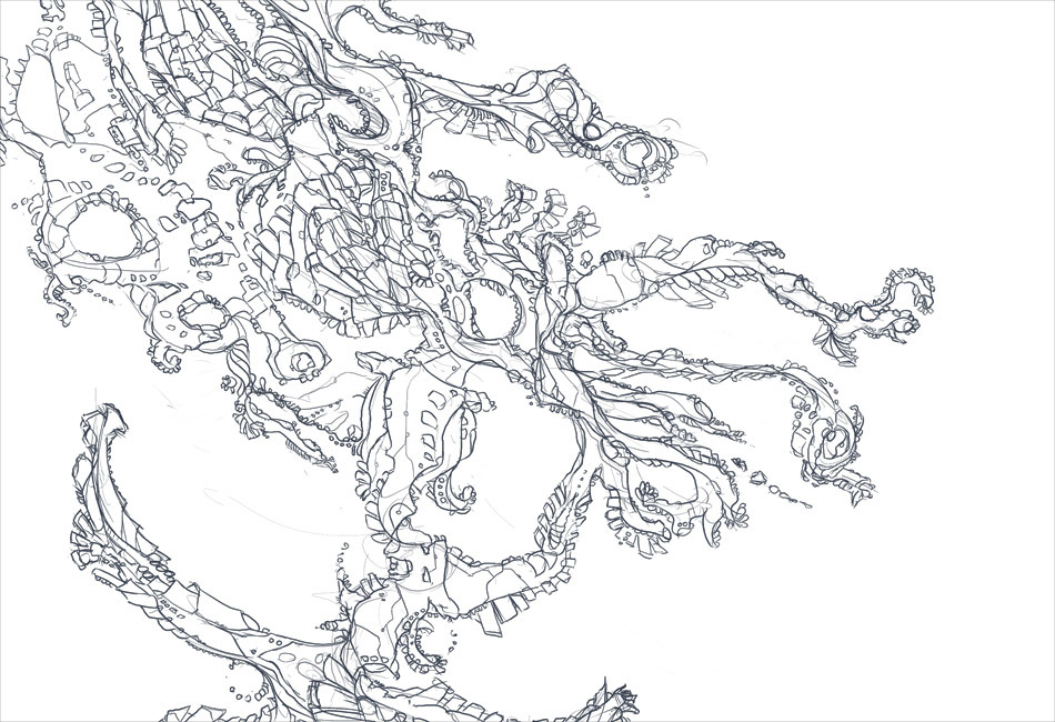
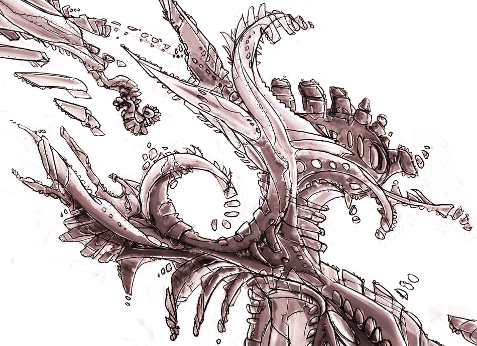
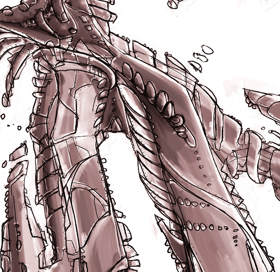
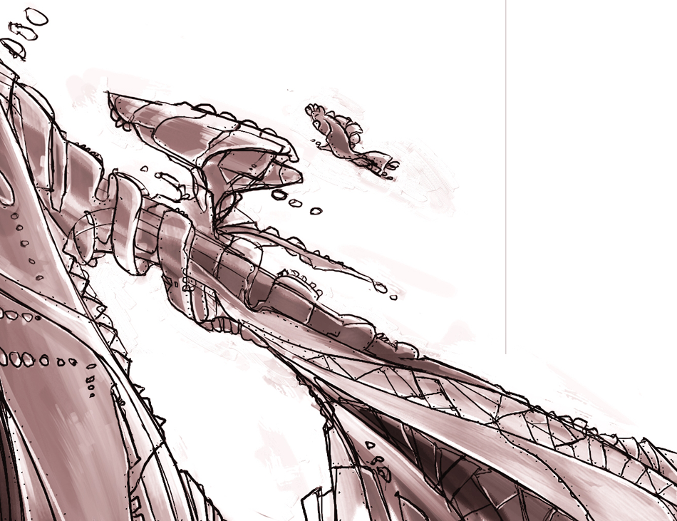
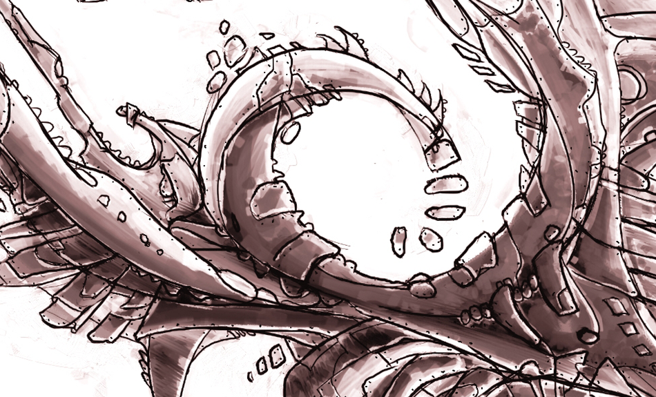
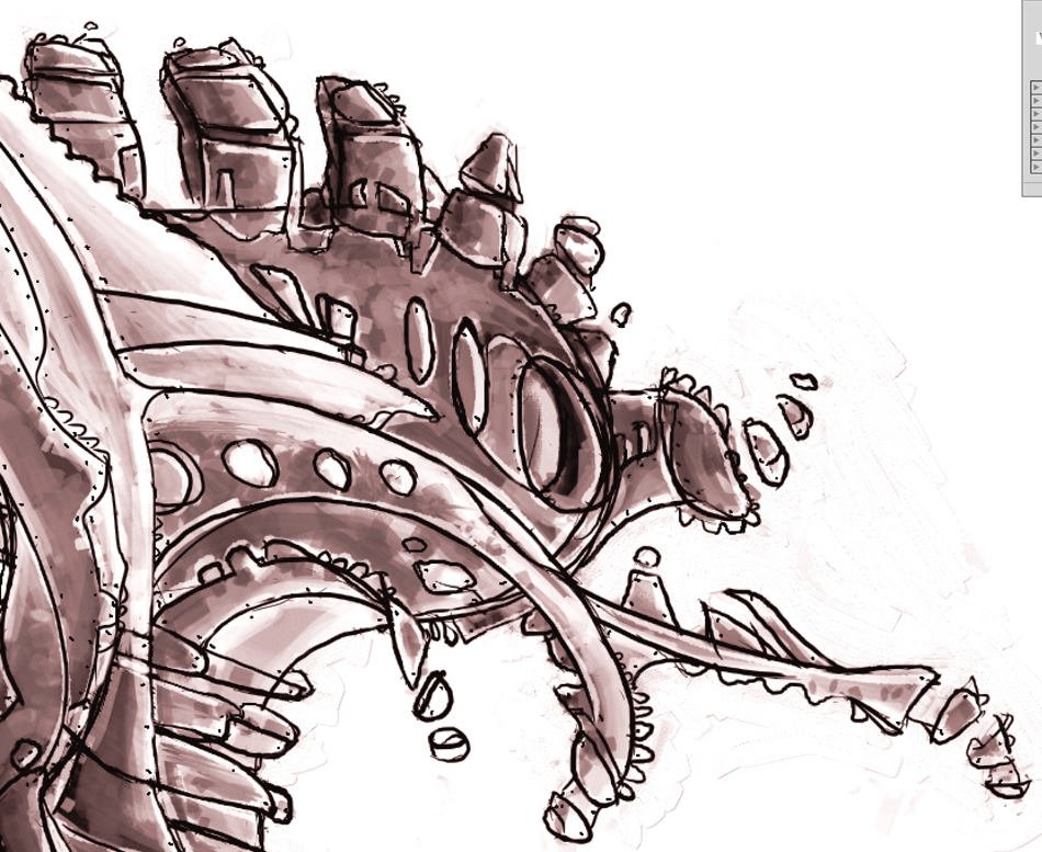
 Illustrations
 Archive
2D Design
3D Design
Animatics
Audio / Remix Sessions
Autodraw
Discography
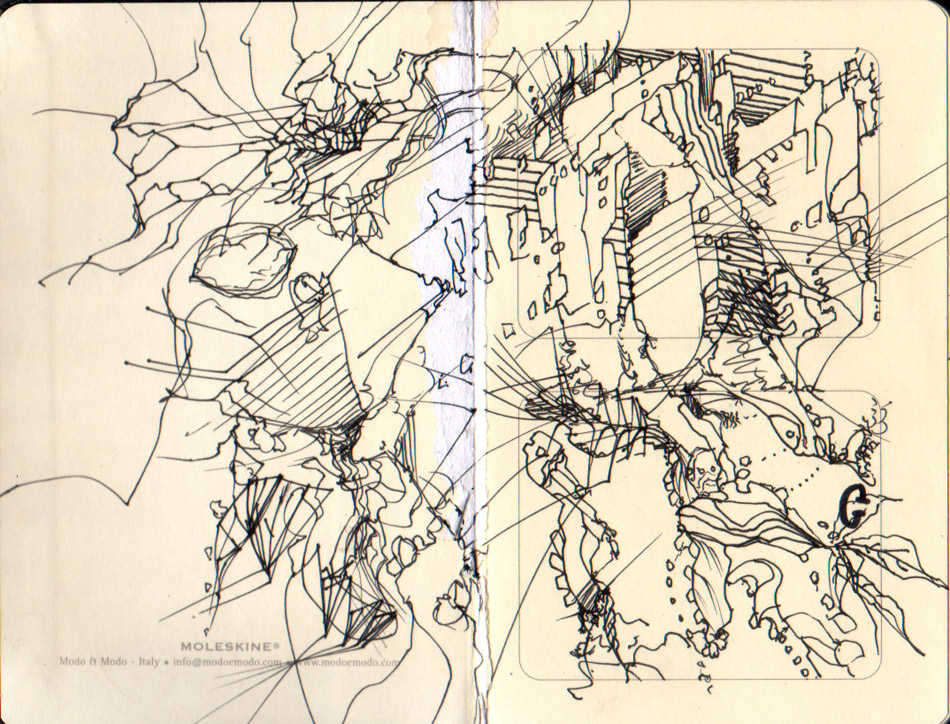
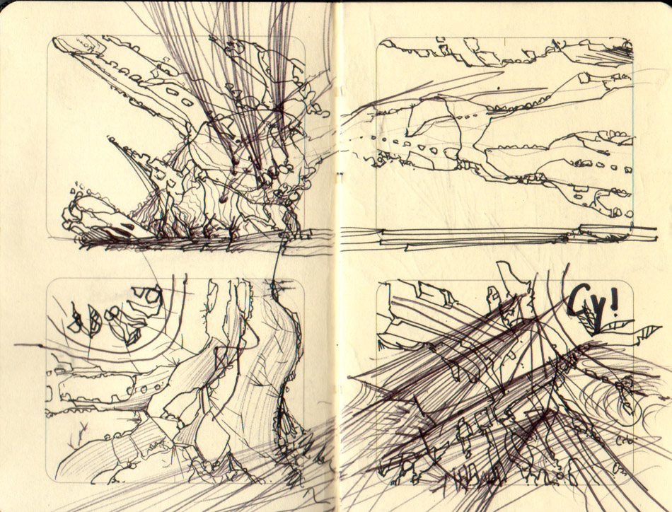
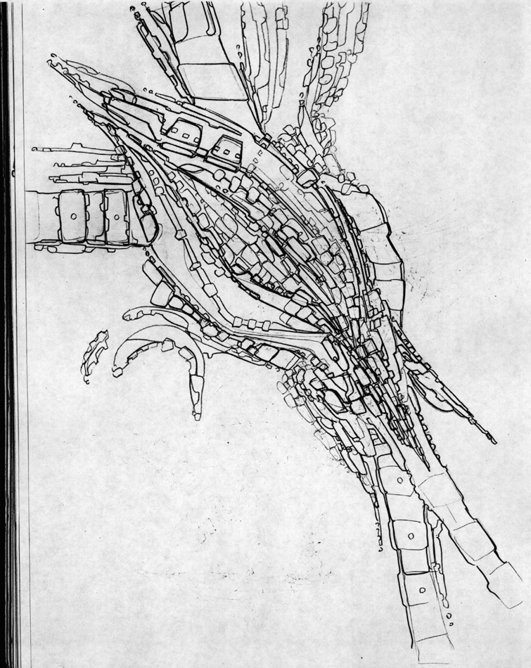
Drawing
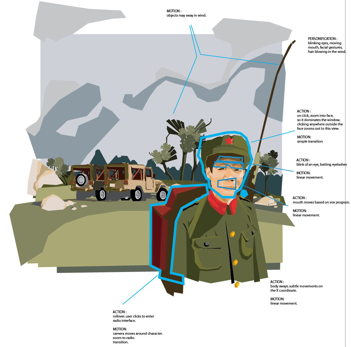
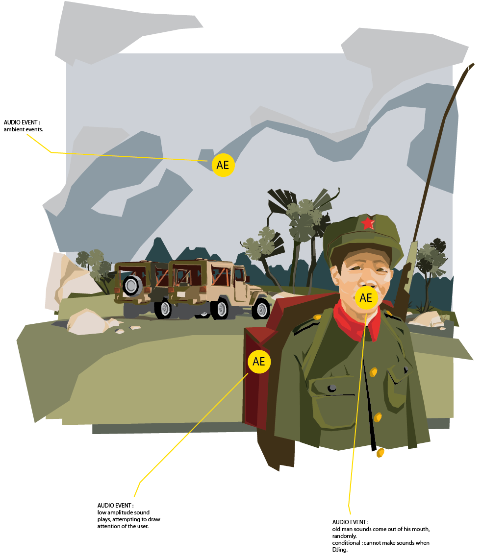
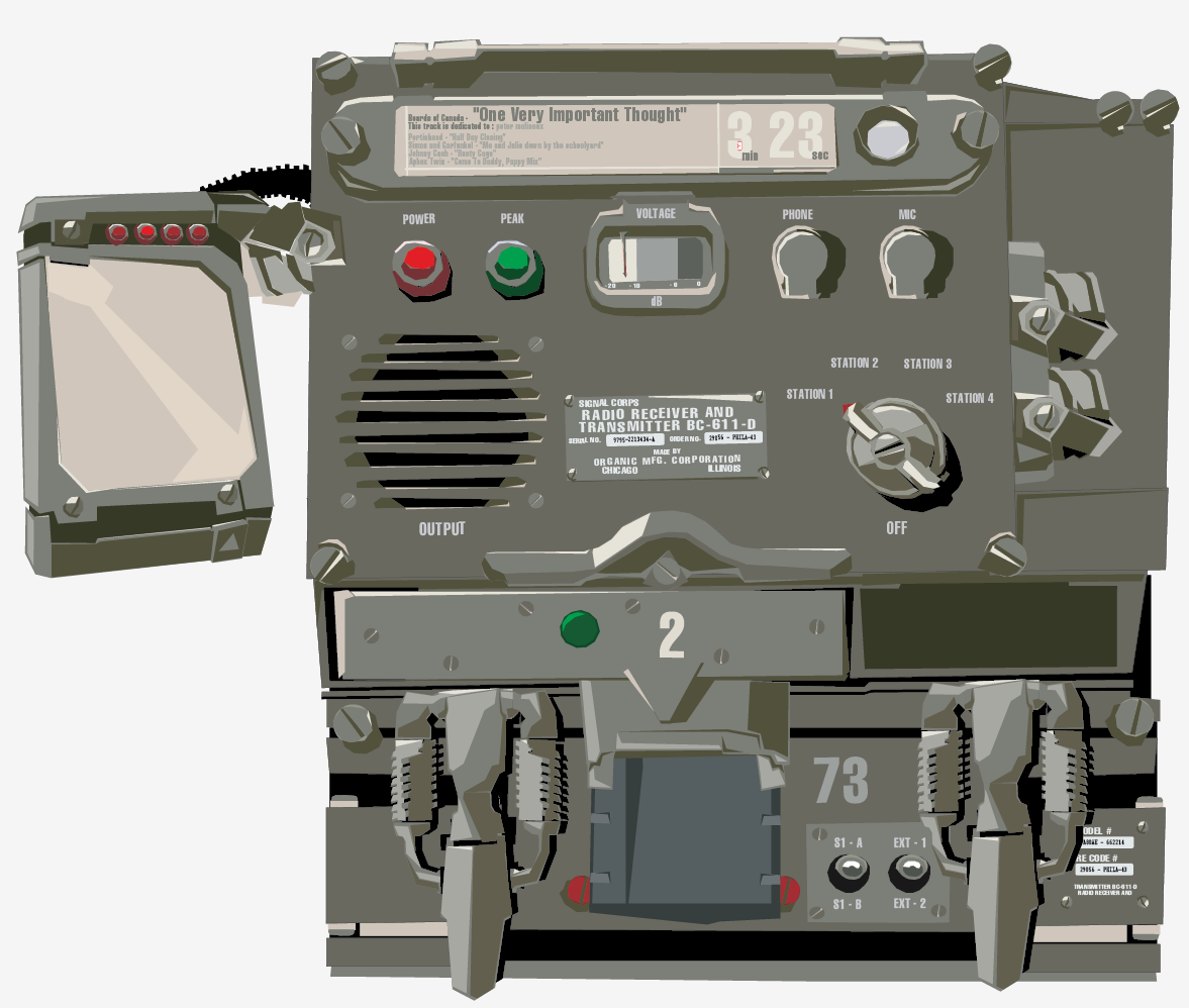
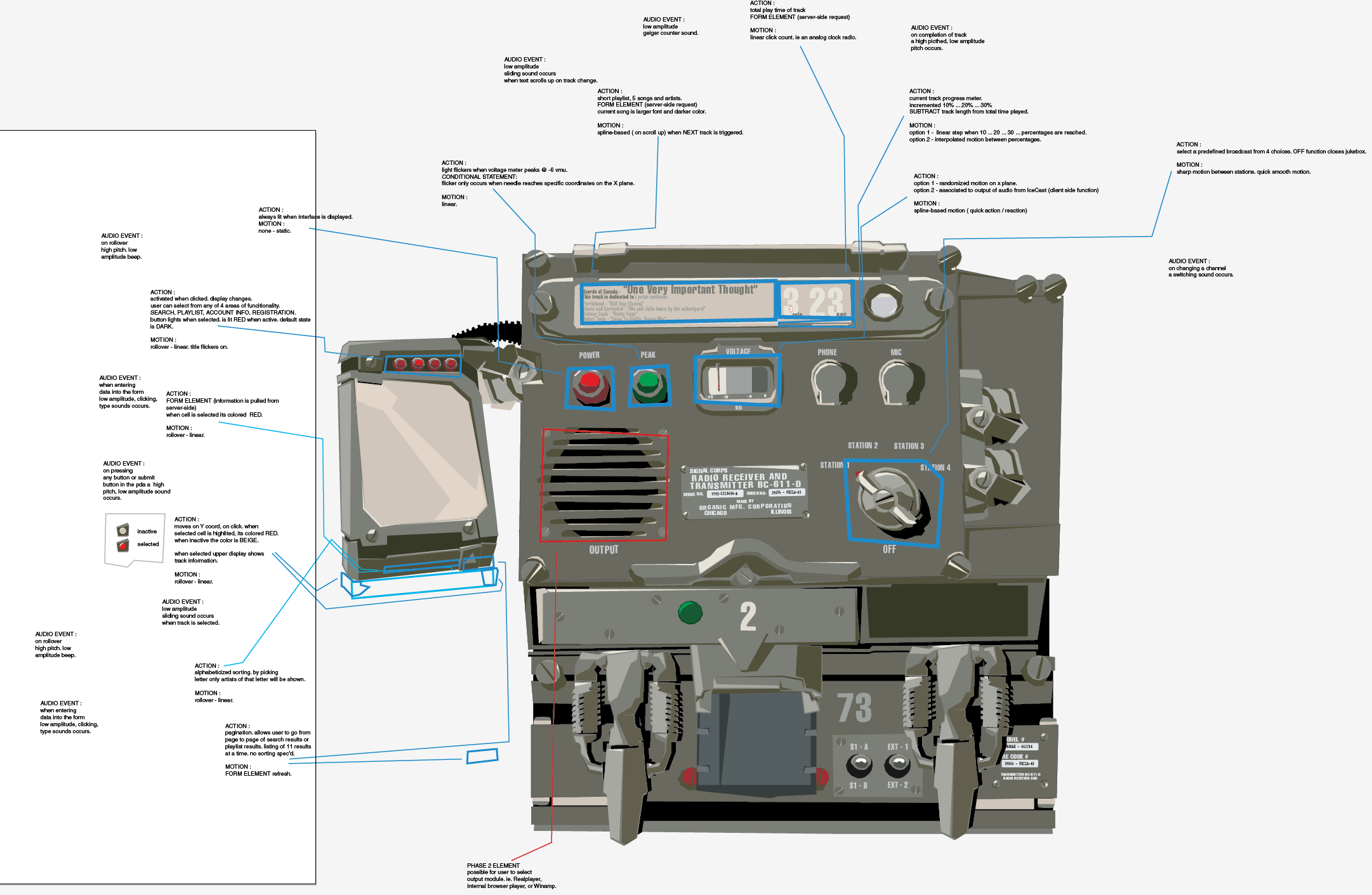
Interaction Design
--------------
Sustain Ability 2005
Resident Evil: Apocalypse
 Resume
or (805) 907-6873
Resume
or (805) 907-6873